You've probably seen this pattern already. A client wants “a quick survey,” someone drops a Typeform link into a WhatsApp broadcast, clicks come in, and then the response rate disappoints everyone.
The problem usually isn't the survey itself. It's the container around it.
A survey landing page isn't just a webpage with a form on it. For agencies pushing traffic from WhatsApp, it's a high-speed conversion asset with a brutally short attention window. People tap from a message thread, glance once, and decide fast whether this is worth their time. If the value, incentive, and time commitment aren't obvious immediately, they leave.
That's why the usual landing page advice falls short. Standard web best practices matter, but WhatsApp traffic changes the order of importance. Mobile layout, speed, friction, and message match move from “nice to have” to deal breakers.
Table of Contents
- Set Your Foundation for High Response Rates
- The Anatomy of a Perfect Survey Landing Page
- Designing Questions That People Actually Answer
- The Psychology of Persuasion Incentives and Copy
- Driving Traffic with WhatsApp and CRM Integration
- Measuring Success and Continuous Optimization
Set Your Foundation for High Response Rates
Teams often still treat surveys like a feedback chore. That framing weakens the page before a designer even opens Figma.
A good survey landing page should serve a business job. It can qualify leads, validate demand before a launch, segment customers for follow-up, uncover objections sales can use, or identify which offer to push next. If you can't connect the survey to revenue, retention, or pipeline quality, the page will turn into a vague “let us know what you think” asset that nobody prioritizes and nobody optimizes.
Treat the survey like a commercial asset
The first question isn't “what should we ask?” It's “what action should this response make possible?”
For agencies, that usually falls into one of three buckets:
- Lead qualification: Use the survey to identify intent, fit, urgency, or service category before a sales call.
- Customer research: Pull language, pain points, and priorities directly from respondents so ad copy and sales messaging get sharper.
- Offer validation: Test appetite for a feature, product angle, pricing structure, or local campaign before spending more on traffic.
Each objective produces a different page. A lead qualification survey can be direct and transactional. A research survey needs more trust and better framing. A validation survey needs a stronger promise about why the respondent's input matters.
Practical rule: If the answers won't change a campaign, a sales route, or a product decision, don't build the survey landing page yet.
Use benchmarks the right way
You won't find clean, statistically validated global data for “survey landing pages” as a separate category. In practice, the best benchmark is dedicated landing page performance, because a survey page is still a focused conversion page.
That gives you a useful baseline. The median landing page conversion rate across industries is 6.6%, and top performers exceed 10% according to Shopify's landing page conversion benchmarks. The same source notes that pages with fewer than 100 words convert 50% better and pages loading in one second convert at three times the rate of pages taking five seconds.
Those numbers matter because they force discipline. If your survey page has a hero image, a long intro, a founder note, six FAQs, and a footer full of links, you're not building for response rate. You're building for internal comfort.
A stronger working standard looks like this:
- Keep the promise narrow. One page, one survey, one outcome.
- Keep the copy short. Enough to explain the value exchange, not enough to trigger skimming.
- Keep the page fast. Survey traffic is impatient. WhatsApp traffic is even less forgiving.
Define success before launch
Before building, write down what a successful response means operationally.
That could be a qualified lead pushed into a CRM stage, a tagged audience segment, a customer insight report, or a trigger for a follow-up offer. Without that endpoint, teams obsess over completion rate alone and miss whether the survey improved business decisions.
A survey landing page that converts below your hope can still be a win if the response quality is strong. A page that gets lots of low-intent completions can still waste a campaign budget.
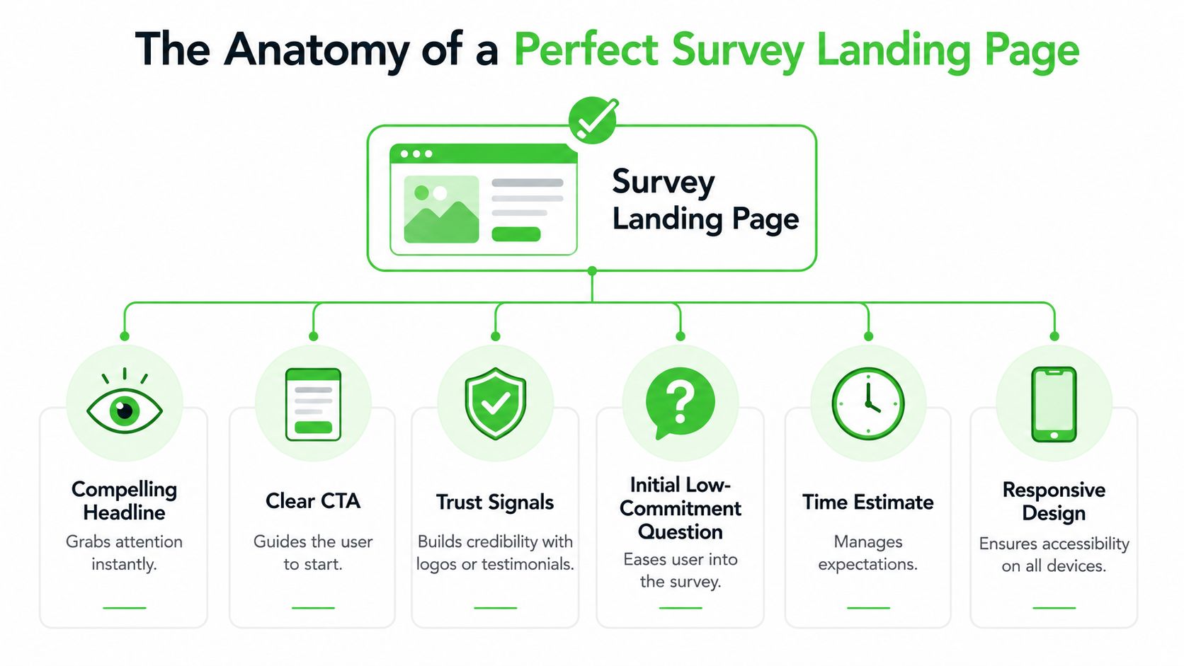
The Anatomy of a Perfect Survey Landing Page
A click from WhatsApp behaves differently from a click from search or email. The visitor arrives mid-scroll, on mobile, and with very little patience. A survey landing page has one job in that moment. Confirm the promise from the message and make the first action feel easy enough to start.
Build for immediate action
Survey pages convert best when every element supports a single decision. Start now or leave.
Researchers at the Nielsen Norman Group found that users often scan web pages in an F-shaped pattern, giving disproportionate attention to the top and left side of the screen early in the visit. That matters on survey traffic because the first screen has to carry the offer, the effort level, and the action without asking the user to hunt for any of it. You can review the original findings in Nielsen Norman Group's research on F-shaped reading patterns on the web.
The base structure I use is simple:
- Headline tied to the message click
- One short line of context
- Visible time estimate
- Benefit or incentive
- Primary CTA or first question
- Trust cue
- Embedded survey or first step
If you need inspiration on how focused pages remove friction, this guide on how to optimize landing page conversions is a useful reference because it shows how reducing distractions improves the odds of action.
What has to appear first
The top section carries the conversion load. On WhatsApp campaigns, I treat it as the continuation of the message, not a new pitch.
Put these elements above the fold:
- A headline that matches the WhatsApp prompt: If the message says “Help us improve delivery times,” the page should repeat that exact value proposition.
- A concrete effort cue: “2 minutes” or “5 quick questions” reduces uncertainty faster than generic copy.
- A reason to complete: reward, better service, early access, or a clear explanation of how responses will be used.
- A start mechanism: button, first multiple-choice question, or embedded first field.
A weak page forces the visitor to interpret. A strong page lets them act.
Use the CTA to reduce friction, not add hype
Button copy matters because survey traffic is action-driven. Unbounce advises matching CTA copy to the specific next step and keeping it concrete, such as “Start survey” or “Get my reward,” instead of vague prompts that make the user pause and decode intent. Their guidance on call-to-action examples and best practices is useful here.
For agency campaigns running through WhatsApp broadcast tools, message match usually beats cleverness. If the outbound message promises a voucher, say that again near the CTA. If the message promises faster support, make that the headline and the button context. The page should feel like one continuous interaction from chat to completion.
What belongs lower on the page
Lower on the page, the goal shifts from grabbing attention to removing final objections. Keep that support tight.
Use this area for:
- Trust signals: brand logo, recognisable client mark, or a short line identifying who is collecting the responses
- Privacy clarity: one plain sentence on data use and whether answers are anonymous
- Short explainer media: useful when the survey affects service changes, research participation, or incentive eligibility
- Light social proof: one compact proof point is enough
Skip anything that opens escape routes or restarts the sales pitch. That includes full navigation, stacked testimonials, blog links, and oversized footers.
The best-performing survey pages feel small on purpose. They respect the speed of the click, especially from WhatsApp, and remove every extra decision between arrival and answer.
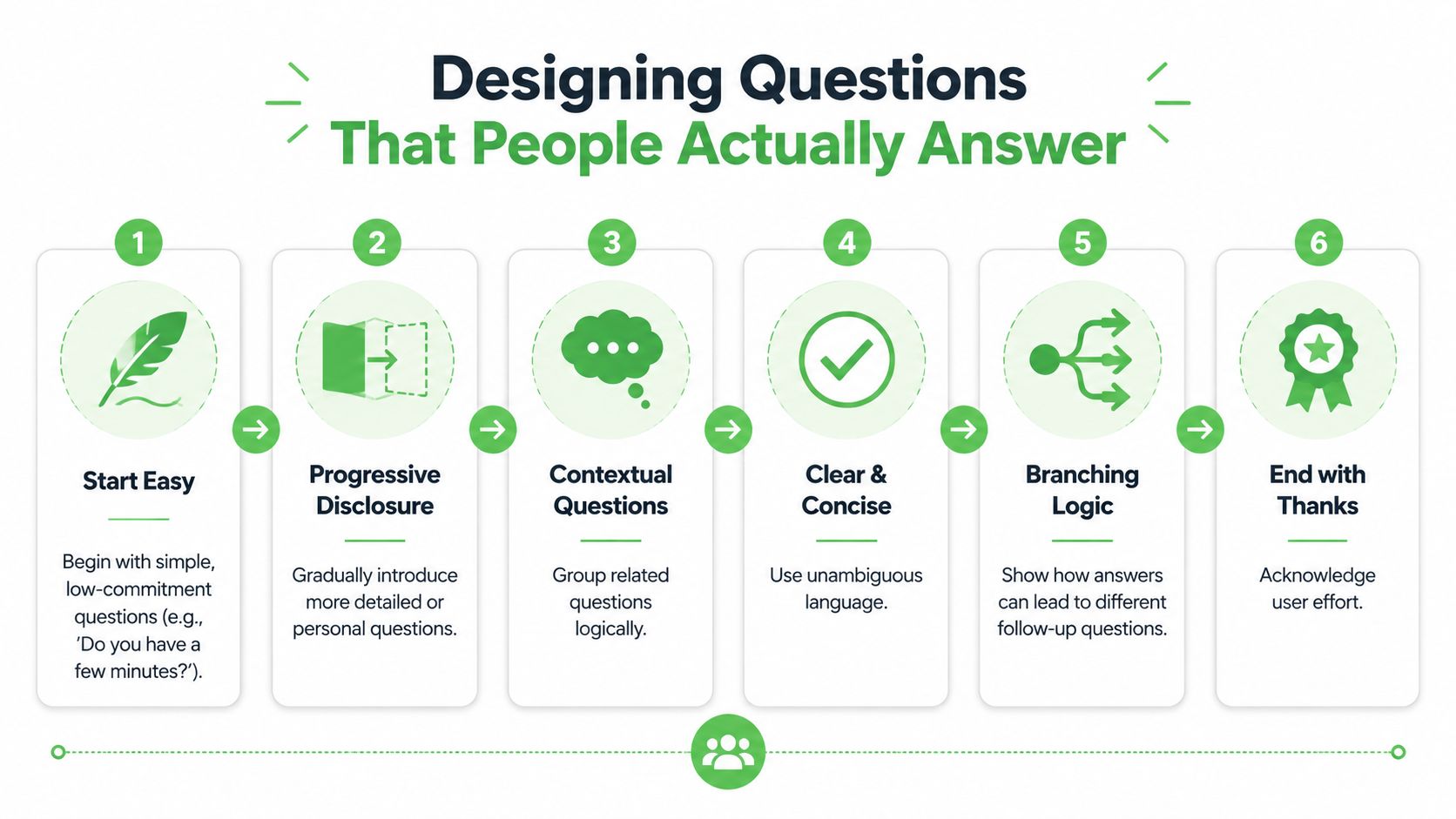
Designing Questions That People Actually Answer
Bad survey pages don't just lose people because of design. They lose them because the question experience feels like work too early.
The fastest fix is to stop treating the survey as a static document and start treating it like a guided sequence.
Why static forms lose people
A long form with every question visible sends the wrong signal immediately. It tells the visitor, “this will take effort,” before they've made a single micro-commitment.
That's why two design choices matter so much. Explicitly stating the survey duration and embedding the form directly on the page reduces bounce rates by 47%, according to SurveyMonkey's guidance on completion rate optimization. The same source notes that starting with 3 to 4 multiple-choice questions before introducing open-ended fields prevents the 55% drop in completion rates seen when more demanding questions come first.
That principle is even more important on mobile. If the user lands from WhatsApp and sees a dense form plus a blank text box asking for a thoughtful answer, they hesitate. Hesitation kills completions.
A short walkthrough helps teams internalize this difference:
| Feature | Static Long-Form Survey | Progressive Disclosure Survey |
|---|---|---|
| First impression | Looks long immediately | Feels manageable |
| Cognitive load | High from the start | Spread across steps |
| Early effort | Often asks for typing fast | Begins with taps and simple choices |
| Mobile experience | Dense and scroll-heavy | Cleaner and easier to scan |
| Momentum | Easy to lose | Builds question by question |
| Best use case | Internal forms or captive audiences | Public-facing conversion pages |
A better question flow
The better sequence is simple:
- Start with easy multiple-choice questions
- Move into segmentation or context
- Introduce one open field only after momentum exists
- Finish with a short confirmation or thank-you state
This is also where branching logic earns its keep. If someone says they're a current customer, they shouldn't see prospect questions. If they pick one location or service type, show the relevant follow-up. Dynamic progression keeps the experience feeling responsive instead of bureaucratic.
Later in the flow, you can use richer media to support understanding. This video is a useful companion if you're refining the survey experience for response quality, not just raw starts.
Static Form vs. Progressive Survey
A practical way to write better questions is to compare weak versions against stronger ones.
Weak opening: “Please describe your overall experience and provide any detailed comments.”
Stronger opening: “How would you rate your experience today?” followed by simple choices.
Weak follow-up: “Tell us everything you wish had been different.”
Stronger follow-up: “What's the one thing we should improve first?”
Weak demographic ask: “Please complete all contact and company details before continuing.”
Stronger demographic ask: Ask only what's necessary after intent is established.
Ask for effort in stages. People answer more when the survey feels like progress, not paperwork.
The best survey landing pages don't just shorten the survey. They organize effort so the user never feels the full weight of it at once.
The Psychology of Persuasion Incentives and Copy
A WhatsApp click is impatient traffic. Someone taps from a private chat, glances at your page, and decides almost immediately whether this is worth their time. Copy has to settle that decision fast. If the value exchange is fuzzy, the click dies before question one.

Lead with the exchange
Put the reward or outcome near the top of the page, in plain language, with no scavenger hunt required. Agencies often lose response volume because they open with brand context, legal language, or a generic “we value your feedback” line. None of that answers the user's first question: what do I get, and why should I care now?
Researchers at the University of Warwick found that incentives can increase survey response rates, but the type and perceived value of the incentive affect the result significantly, especially in shorter consumer surveys as summarized by the European Survey Research Association. That matches what performs in campaign work. Low-friction traffic from WhatsApp responds best when the reward is immediate, believable, and easy to redeem.
Use incentives that fit the audience and the amount of effort:
- Local business surveys: discount, loyalty credit, free add-on, or priority booking
- SaaS and service research: audit summary, early access, template, or consultation priority
- Community and creator surveys: bonus resource, member perk, or waitlist priority
If you run local campaigns, a system for coupon management for local businesses can make the reward side cleaner, especially when you need a trackable incentive tied to completion.
Write copy around the payoff
Good survey copy answers three questions fast. Why this survey? Why now? What happens after I respond?
That is why outcome-led copy usually beats administrative copy. Administrative copy sounds like work. Outcome-led copy sounds useful.
Compare the difference:
Administrative: “Take our customer survey”
Outcome-led: “Answer 5 quick questions and get 10% off your next visit”
Administrative: “Complete this short questionnaire”
Outcome-led: “Tell us what to fix first so your next booking is easier”
Administrative: “We are collecting feedback”
Outcome-led: “Your answers help us improve wait times and service options”
For WhatsApp traffic, I keep headlines tight and concrete. Specificity wins. “2-minute survey” performs better than “short survey.” “Get a free dessert coupon after completion” performs better than “receive a special reward.” Users from broadcast campaigns scan for proof, not polish.
Trust copy matters too, especially if the page asks for contact details or location data. The American Association for Public Opinion Research notes that explaining confidentiality, survey purpose, and use of responses helps reduce refusal and breakoff risk in self-administered surveys in its respondent cooperation guidance. Put those answers where people hesitate, not buried in a footer.
A practical trust block can be as simple as:
- Time: “Takes about 2 minutes”
- Privacy: “Your answers stay private and are only used to improve service”
- Reward: “Coupon sent immediately after completion”
- Contact: “Optional email or phone only if you want follow-up”
People finish surveys when the trade feels fair, the benefit is visible, and the wording respects the context of the click.
The best survey landing pages sound clear, specific, and worth it. That matters even more on WhatsApp, where the user did not arrive to browse. They arrived to make a fast yes or no decision.
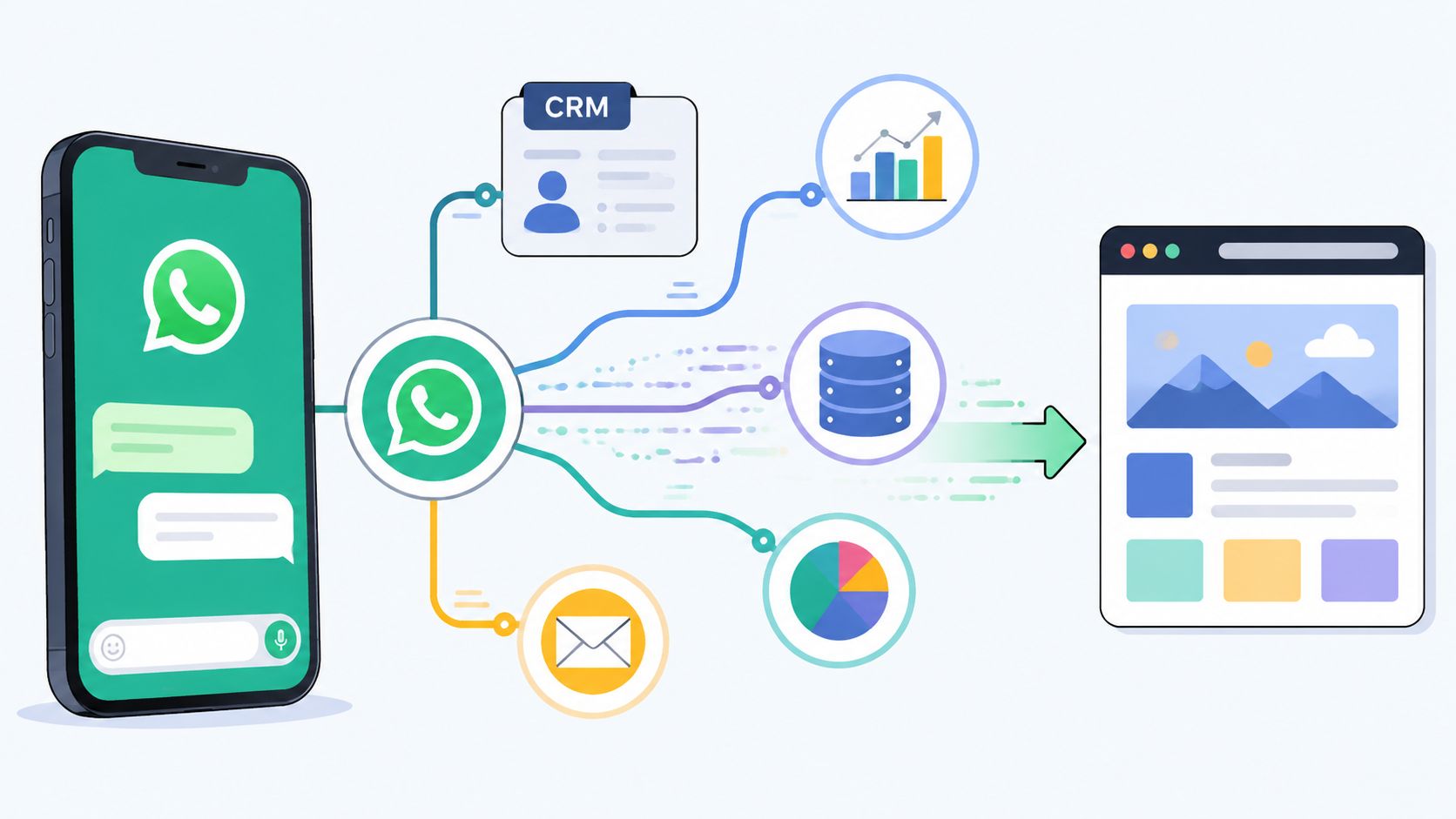
Driving Traffic with WhatsApp and CRM Integration
In this scenario, most agencies either create advantage or create waste.
The survey landing page can be well designed and still underperform if the traffic source, click path, and CRM handoff are sloppy. WhatsApp changes the mechanics because the user arrives from a private message environment with almost no patience for reorientation.
Build the click path backwards
Start with the destination, then engineer the message.
For survey traffic from mobile messaging apps like WhatsApp, users often decide within a 3-second window whether to engage or leave, and dynamic progression reduces abandonment by 35% compared with static forms according to Formstack's conversion optimization resource.
That means your WhatsApp message and landing page have to match tightly. If the message promises a reward, the page must show it immediately. If the message says “2-minute survey,” the page needs that exact expectation near the top. Any mismatch creates suspicion.
A clean WhatsApp-to-page sequence usually looks like this:
- Broadcast message with a single promise
- Tracked smart link or QR destination
- Mobile-first survey landing page
- Embedded, progressive survey
- Thank-you state with next action
- CRM sync with source attribution
Use WhatsApp like a distribution system, not a blast tool
Agencies get better results when they stop sending generic broadcasts and start segmenting audiences by intent, list source, or customer stage.
Practical tactics that work well:
- Use smart links per segment: one link for warm customers, another for cold leads, another for community members. That makes attribution cleaner.
- Rewrite the pre-click message for context: customers need a different ask than prospects.
- Drop people into a page, not a detached form: landing pages preserve message match and branding.
- Keep the first interaction tappable: avoid making someone type before they've committed.
This also connects with broader list strategy. If you're using surveys to grow owned audiences, this primer on What is email list building is useful because it frames opt-ins, segmentation, and follow-up as an integrated system instead of isolated tactics.
Send data back to the CRM fast
A survey campaign becomes valuable when the response changes what happens next.
The operational setup should be simple:
- Map source data: WhatsApp group, campaign, QR code, keyword, or audience segment
- Tag respondents automatically: lead type, location, intent category, service interest
- Trigger the next step: nurture sequence, rep assignment, reminder message, or offer delivery
- Preserve open-text responses: don't just store scores. Keep the language people used
If the survey response lives in a spreadsheet for a week, the campaign loses half its value. Agencies should wire survey completions into CRM actions while the contact is still warm and the campaign context is still obvious to the team.
The main upside isn't just more completions. It's faster routing, cleaner attribution, and better follow-up without manual cleanup.
Measuring Success and Continuous Optimization
A survey landing page can post a healthy completion rate and still fail the campaign.
I see this a lot with WhatsApp traffic. A broadcast gets the click, the page collects responses, and the team assumes the funnel worked. Then the CRM fills with low-intent contacts, vague answers, or leads that never progress because the page filtered poorly. For agencies buying media or sending volume through WhatsApp, that is wasted budget and wasted attention.
Measure the page by business output first, then by form mechanics.
Track the metrics that expose friction and lead quality
A useful dashboard stays tight. It should tell you three things fast: did the page get the click to start, where did people slow down, and did the response create sales value.
Track these metrics:
- Landing page conversion rate: how many visitors start the survey and how many finish it
- Question-level drop-off: the exact question where respondents quit
- Completion time: whether the flow feels quick enough for WhatsApp visitors who arrived with limited patience
- Open-ended response quality: whether answers are detailed enough to route, segment, or follow up
- Source-level performance: which WhatsApp lists, broadcasts, QR codes, or audience segments send stronger respondents
- Post-survey outcome: booked call, qualified lead, rep handoff, reward claim, or pipeline creation
Then review behavior, not just totals. Session recordings, heatmaps, and form analytics show whether people hesitate on a sensitive question, miss the incentive, or fail to see the CTA on mobile.
A short survey can still feel slow on a phone screen.
That matters more with WhatsApp than with colder traffic sources. People tap from a message thread, scan the page in seconds, and leave fast if the flow feels heavier than the promise in the message. Agencies that ignore this context often optimize for form completion while losing lead quality, or optimize for volume while hurting downstream close rates.
Run focused tests with a commercial goal
Treat every test like a bet tied to revenue, not a design preference.
Good A/B test candidates include:
- Headline angle: immediate benefit versus research-focused framing
- Incentive presentation: plain copy versus a visible reward block near the top
- CTA wording: action tied to the outcome versus generic submit language
- Form structure: one-question-at-a-time flow versus grouped multi-question layout
- Trust copy: privacy reassurance near the first step versus near the submit button
- Mobile page length: tighter first screen versus longer explanation before the first tap
The biggest gains usually come from structural changes. A stronger first screen, a better question order, or a cleaner mobile layout will beat cosmetic tweaks in most accounts I have worked on. Button color tests rarely rescue a weak offer or a slow start.
Keep the optimization cycle simple:
- Review response and behavior data by traffic source
- Find one friction point or one quality issue
- Change one variable with a clear hypothesis
- Launch the test on a meaningful slice of WhatsApp traffic
- Keep the winner, document the result, and test the next bottleneck
Also separate performance by intent source. Traffic from a re-engagement broadcast often behaves differently from traffic sent by a sales rep, a QR code in-store, or a cold prospect list. If you blend all of that into one average, you obscure the core lesson and make weak decisions.
Consistency wins here. Agencies that beat benchmarks do not guess harder. They run tighter loops, read mobile behavior closely, and judge success by what happens after the survey, not just by how many people reached the thank-you screen.
If your agency wants to turn WhatsApp survey traffic into a trackable, automated lead flow, Double My Leads gives you the infrastructure to do it without stitching together multiple tools. You can launch tracked smart links, route responses with source attribution, sync contacts into your CRM, and build white-labeled WhatsApp workflows that make survey campaigns easier to sell and easier to scale.

