You've got a site that looks good, traffic is landing on the right pages, and the contact form technically works. But forms are slow. A visitor has to stop, think, type, submit, and then wait. If they're already a WhatsApp user, that feels like unnecessary friction.
That's why a WhatsApp button usually beats a passive “Contact Us” link. It turns a moment of intent into a live conversation. For agencies, local businesses, SaaS teams, and ecommerce brands, that's often the difference between “maybe later” and “send message now.”
The good news is that WhatsApp button HTML is simple at the basic level. The tricky part starts after that. A lot of guides show a wa.me link and stop there. They don't deal with mobile failures, iOS quirks, tracking, styling, or what happens when you need something maintainable across WordPress, Shopify, and custom builds. That's where most implementations fall apart.
Table of Contents
- Why Add a WhatsApp Button to Your Website
- The Foundation A Basic WhatsApp Click-to-Chat Link
- Styling Your Button with Custom CSS
- Creating a Floating Chat Widget
- Advanced Techniques for Smarter Buttons
- From Code to Platform When to Upgrade Your Setup
- Choosing the Right WhatsApp Button for Your Site
Why Add a WhatsApp Button to Your Website
A WhatsApp button works best when a visitor already has a question. Pricing. Availability. Delivery. Scope. Support. They don't want a ticket number. They want an answer.
That's the practical reason to add one. It doesn't replace every contact method, and it shouldn't. But it gives people a fast lane when they're close to taking action.
For marketers and agencies, that matters because response speed shapes conversion quality. If a prospect can ask something in a familiar messaging app, your team gets context faster and the conversation starts with less friction than a form submission. For service businesses, it also reduces vague leads. A pre-filled message can tell you what page they came from or what service they're asking about before anyone replies.
Practical rule: Use a WhatsApp button when the visitor is likely to need clarification before buying, booking, or enquiring.
There's also a deployment reason. A basic button doesn't need a heavy plugin or a custom backend. You can ship a working version with HTML alone, then improve it in stages:
- Basic link if you need something live today
- Styled button if you care about visibility and brand fit
- Floating widget if you want persistent access across pages
- Tracked and scalable setup if you manage campaigns, clients, or multiple agents
That progression is what typically succeeds. Start simple. Make sure it opens correctly on user devices. Then add styling, behavior, and tracking only where they help.
The Foundation A Basic WhatsApp Click-to-Chat Link
The core implementation is just an anchor tag. No SDK. No iframe. No complicated embed.
According to Infobip's WhatsApp website setup guide, a WhatsApp button on an HTML website is implemented with a standard HTML <a> tag that points to https://wa.me/<number>. That method works across mobile and desktop browsers, opening the mobile app on phones and WhatsApp Web on desktop. The number must be in international format without leading zeros or symbols.
The fastest version
Use this:
<a href="https://wa.me/15551234567" target="_blank" rel="noopener">
  Chat with us on WhatsApp
</a>
Replace 15551234567 with your business number in international format.
That means:
- Include the country code
- Remove the plus sign
- Remove spaces
- Remove brackets and dashes
- Don't keep a local leading zero
If your team gets this wrong, the button may look fine but fail when someone taps it.
Here's the practical format check:
| Example | Result |
|---|---|
https://wa.me/15551234567 |
Correct |
https://wa.me/+15551234567 |
Wrong |
https://wa.me/1 555 123 4567 |
Wrong |
https://wa.me/(1555)1234567 |
Wrong |
What usually breaks it
Most bad implementations fail for boring reasons, not advanced ones. The common problems are:
- Wrong number formatting. Teams paste the number exactly as they display it on the site.
- No device testing. It works in a desktop browser, so everyone assumes it's done.
- Theme-level conflicts. The link is fine, but the button sits under another sticky element or gets blocked visually.
- CMS editor issues. Some builders strip attributes or wrap buttons in unexpected markup.
If you're building for a client site, keep the first deployment plain. Don't start with animation, custom icon stacks, and a conditional trigger. Start with the plain anchor, click it on your phone, click it on desktop, confirm it opens the right destination, then layer on presentation.
If the raw
wa.melink doesn't work first, styling won't save it.
This simple version is also the most stack-agnostic option. It fits in static HTML, a WordPress Custom HTML block, a Shopify template, a footer include, or a plain CTA button field in a page builder.
Styling Your Button with Custom CSS
A working link is enough for testing. It's usually not enough for production. A bare text link gets ignored, especially on pages with multiple calls to action.
Turn a plain link into a real button
Start with a semantic anchor and style it like a button:
<a class="wa-button" href="https://wa.me/15551234567" target="_blank" rel="noopener" aria-label="Chat with us on WhatsApp">
  WhatsApp Us
</a>
.wa-button {
  display: inline-flex;
  align-items: center;
  justify-content: center;
  gap: 10px;
  background: #25D366;
  color: #ffffff;
  text-decoration: none;
  font-weight: 600;
  padding: 14px 20px;
  border-radius: 999px;
  box-shadow: 0 10px 25px rgba(0, 0, 0, 0.15);
  transition: transform 0.2s ease, box-shadow 0.2s ease;
}

.wa-button:hover {
  transform: translateY(-1px);
  box-shadow: 0 12px 28px rgba(0, 0, 0, 0.18);
}

.wa-button:focus-visible {
  outline: 2px solid #111;
  outline-offset: 3px;
}
This gives you a clean pill-shaped CTA that stands out without looking bolted on.
Position matters too. A button inside hero content behaves differently from one tucked under FAQs or pinned near pricing. If you need a refresher on layout control, this guide to effective CSS styling is useful for handling fixed, absolute, and inline placement without breaking the rest of the UI.
Add an SVG icon cleanly
A WhatsApp icon helps recognition. SVG is usually the right choice because it stays crisp and scales better than a raster image.
<a class="wa-button" href="https://wa.me/15551234567" target="_blank" rel="noopener" aria-label="Chat with us on WhatsApp">
  <svg width="20" height="20" viewBox="0 0 32 32" aria-hidden="true" focusable="false">
    <path fill="currentColor" d="M16 3C9.383 3 4 8.383 4 15c0 2.559.805 4.93 2.176 6.88L5 29l7.33-1.98A11.94 11.94 0 0 0 16 27c6.617 0 12-5.383 12-12S22.617 3 16 3zm0 21.6c-1.941 0-3.75-.555-5.285-1.516l-.38-.238-4.35 1.176 1.163-4.242-.25-.41A9.55 9.55 0 0 1 6.4 15C6.4 9.706 10.706 5.4 16 5.4S25.6 9.706 25.6 15 21.294 24.6 16 24.6z"></path>
    <path fill="currentColor" d="M21.2 18.7c-.2-.1-1.2-.6-1.4-.7-.2-.1-.4-.1-.6.1-.2.2-.7.7-.9.9-.2.2-.3.2-.5.1-.2-.1-1-.4-1.8-1.2-.7-.6-1.2-1.4-1.3-1.6-.1-.2 0-.4.1-.5.1-.1.2-.3.3-.4.1-.1.1-.3 0-.4 0-.1-.6-1.5-.8-2.1-.2-.6-.4-.5-.6-.5h-.5c-.2 0-.4.1-.6.3-.2.2-.8.8-.8 2s.9 2.3 1 2.5c.1.2 1.8 2.8 4.4 4 .6.3 1.1.5 1.5.6.6.2 1.1.2 1.5.1.5-.1 1.2-.5 1.3-1 .2-.5.2-1 .1-1.1 0-.1-.2-.2-.4-.3z"></path>
  </svg>
  <span>WhatsApp Us</span>
</a>
A few styling decisions make a big difference:
- Rounded shape works well for chat CTAs
- Strong contrast helps on busy landing pages
- Visible focus state matters for keyboard navigation
- An
aria-labelhelps clarify purpose for assistive tech
If you're placing this button more than once on a page, vary the label by context. “Ask about pricing” is often better than repeating “WhatsApp Us” everywhere.
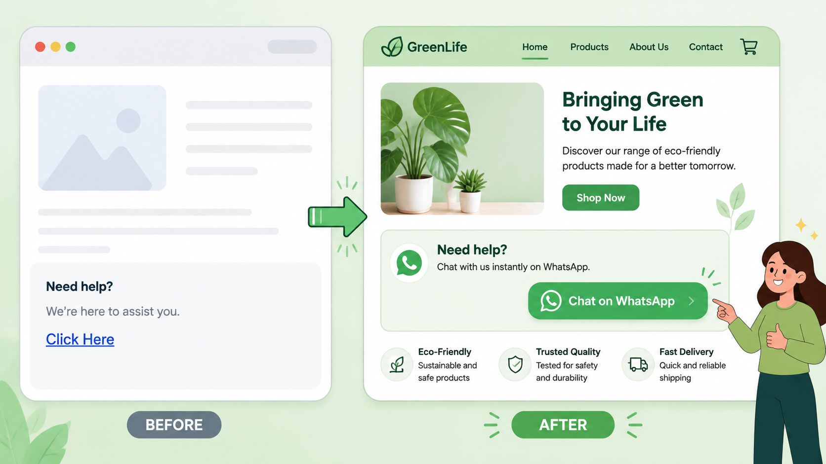
Creating a Floating Chat Widget
A floating widget is the version many organizations prefer. It stays visible while the visitor scrolls, so they don't need to hunt for a contact section.
Done badly, it's annoying. Done well, it's one of the most useful low-effort UI additions on a lead-gen site.
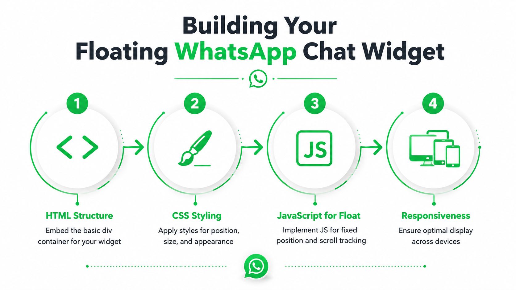
A good floating widget has three jobs:
- Stay visible without covering key actions
- Open WhatsApp cleanly
- Appear at the right time, not the second the page loads
Teams building support-heavy products often use website chat as a first response channel. This write-up on how chat widgets improve SaaS support is worth reading if you're thinking beyond a simple contact link and into support workflow design.
The HTML markup
Keep the structure light:
<a
  class="wa-float"
  id="waFloat"
  href="https://wa.me/15551234567?text=Hi%20there%2C%20I%20have%20a%20question."
  target="_blank"
  rel="noopener"
  aria-label="Chat with us on WhatsApp"
>
  <svg width="28" height="28" viewBox="0 0 32 32" aria-hidden="true" focusable="false">
    <path fill="currentColor" d="M16 3C9.383 3 4 8.383 4 15c0 2.559.805 4.93 2.176 6.88L5 29l7.33-1.98A11.94 11.94 0 0 0 16 27c6.617 0 12-5.383 12-12S22.617 3 16 3zm0 21.6c-1.941 0-3.75-.555-5.285-1.516l-.38-.238-4.35 1.176 1.163-4.242-.25-.41A9.55 9.55 0 0 1 6.4 15C6.4 9.706 10.706 5.4 16 5.4S25.6 9.706 25.6 15 21.294 24.6 16 24.6z"></path>
    <path fill="currentColor" d="M21.2 18.7c-.2-.1-1.2-.6-1.4-.7-.2-.1-.4-.1-.6.1-.2.2-.7.7-.9.9-.2.2-.3.2-.5.1-.2-.1-1-.4-1.8-1.2-.7-.6-1.2-1.4-1.3-1.6-.1-.2 0-.4.1-.5.1-.1.2-.3.3-.4.1-.1.1-.3 0-.4 0-.1-.6-1.5-.8-2.1-.2-.6-.4-.5-.6-.5h-.5c-.2 0-.4.1-.6.3-.2.2-.8.8-.8 2s.9 2.3 1 2.5c.1.2 1.8 2.8 4.4 4 .6.3 1.1.5 1.5.6.6.2 1.1.2 1.5.1.5-.1 1.2-.5 1.3-1 .2-.5.2-1 .1-1.1 0-.1-.2-.2-.4-.3z"></path>
  </svg>
</a>
The CSS layer
Use fixed positioning and keep the hit area large enough to tap comfortably:
.wa-float {
  position: fixed;
  right: 18px;
  bottom: 18px;
  width: 60px;
  height: 60px;
  border-radius: 999px;
  display: inline-flex;
  align-items: center;
  justify-content: center;
  background: #25D366;
  color: #fff;
  text-decoration: none;
  box-shadow: 0 10px 25px rgba(0, 0, 0, 0.2);
  z-index: 9999;
  opacity: 0;
  transform: translateY(16px);
  pointer-events: none;
}

.wa-float.is-visible {
  animation: waFadeUp 1000ms ease forwards;
  animation-delay: 1s;
  pointer-events: auto;
}

@keyframes waFadeUp {
  from {
    opacity: 0;
    transform: translateY(16px);
  }
  to {
    opacity: 1;
    transform: translateY(0);
  }
}
That animation pattern is consistent with common floating button behavior described in the implementation guidance covered earlier. It keeps the button hidden at first, then fades it upward into place and holds the last frame.
The JavaScript behavior
You don't need much JavaScript. A delayed reveal is enough for most sites.
<script>
  window.addEventListener('load', function () {
    var waButton = document.getElementById('waFloat');

    setTimeout(function () {
      waButton.classList.add('is-visible');
    }, 1500);
  });
</script>
If you prefer a scroll-based trigger:
<script>
  window.addEventListener('scroll', function () {
    var waButton = document.getElementById('waFloat');
    var scrollTrigger = window.innerHeight * 0.5;

    if (window.scrollY > scrollTrigger) {
      waButton.classList.add('is-visible');
    }
  });
</script>
A practical embed note. Put this widget near the end of the <body> or inside a global footer include. That gives you site-wide coverage and avoids loading it too early.
Before you ship it, test these conditions:
- Mobile viewport and desktop browser
- Cookie banner active
- Sticky add-to-cart or checkout buttons
- Header navigation overlays
- Any other chat or accessibility launcher
Here's a useful visual walkthrough of the implementation flow:
Advanced Techniques for Smarter Buttons
A working button is functional. A smart button gives your team context, cleaner attribution, and fewer device-specific failures.
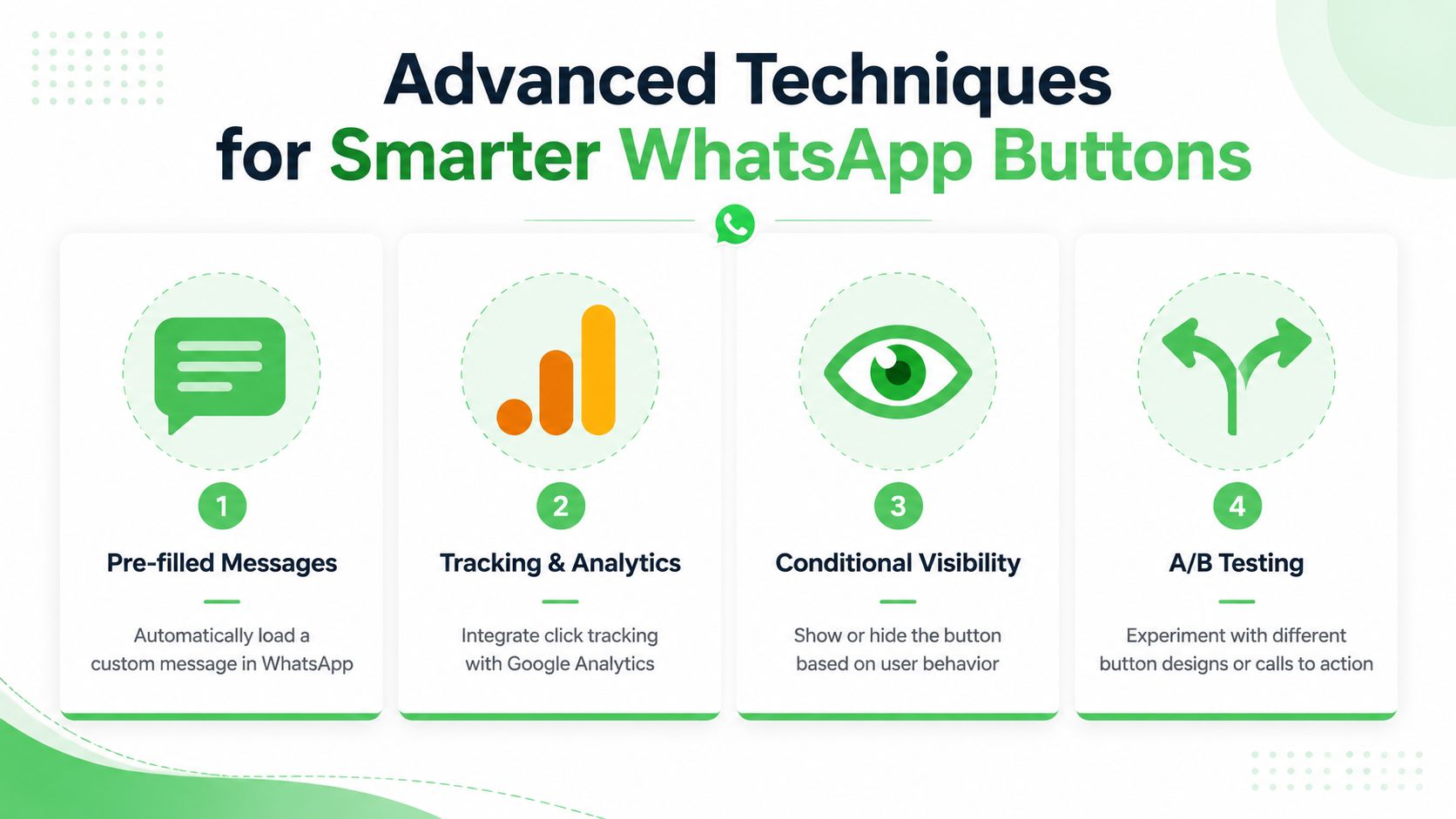
Pre-fill the first message
WhatsApp supports a text parameter. That lets you open the chat with a draft already filled in.
<a href="https://wa.me/15551234567?text=Hi%20there%2C%20I%27m%20interested%20in%20your%20pricing." target="_blank" rel="noopener">
  Ask about pricing
</a>
The important part is URL encoding. Spaces and special characters can't just be dropped into the link raw. Encode them properly so the message survives browsers, builders, and CMS wrappers.
A few examples:
| Character | Encoded form |
|---|---|
| Space | %20 |
| Comma | %2C |
| Apostrophe | %27 |
| Question mark | %3F |
Service-page-specific links prove useful. A pricing page can open with “Hi, I'm interested in your pricing.” A support page can open with “Hi, I need help with my account.” Same number. Better context.
Pre-filled text doesn't automate the conversation. It removes the blank-page effect that makes people type “Hi” and stall.
Add tracking without overcomplicating it
You can't rely on the wa.me click alone for full attribution. What you can do is track the on-site click and preserve campaign context in your own workflow.
The practical setup is usually two parts:
- Track the click event on your site in your analytics tool or tag manager
- Pass campaign detail into the pre-filled message so the sales or support team sees context immediately
For example:
<a
  id="waPricingBtn"
  href="https://wa.me/15551234567?text=Hi%20there%2C%20I%27m%20interested%20in%20your%20pricing.%20Campaign%3Dspring_launch%20Source%3Dgoogle%20Medium%3Dcpc"
  target="_blank"
  rel="noopener"
>
  Ask on WhatsApp
</a>
And then a simple click handler:
<script>
  document.getElementById('waPricingBtn').addEventListener('click', function () {
    if (window.gtag) {
      window.gtag('event', 'whatsapp_click', {
        button_location: 'pricing_section'
      });
    }
  });
</script>
Strictly speaking, UTMs are built for URLs. Since wa.me is the destination, the cleaner approach is often to keep your on-site click tracking separate and include campaign labels in the message text or in the downstream links you later share inside the conversation. That gives marketing a usable trail without pretending WhatsApp links behave like normal landing-page URLs.
Fix mobile and desktop compatibility properly
This is the part most tutorials skip, and it's where the actual support tickets come from.
A recurring complaint in developer discussions is that the WhatsApp button works on desktop but fails on mobile, especially iOS. One cited issue is incorrect number formatting, especially including the + symbol, and a lack of CMS-specific handling. A Reddit discussion referenced in the verified data notes that these issues can lead to an estimated 22% of mobile leads being lost (discussion reference).
The fix isn't glamorous:
- Use international format without
+ - Test the final rendered link, not just the code snippet you intended
- Check CMS behavior
- Verify the tap target on iPhone and Android
- Use
aria-labelon icon-only buttons - Make sure another fixed element isn't intercepting taps
Different platforms introduce different headaches:
| Platform | Common issue | Safer approach |
|---|---|---|
| WordPress | Builder wraps or strips button markup | Use a Custom HTML block for the raw anchor |
| Elementor | Link settings buried inside widget config | Confirm the final rendered href in the browser |
| Shopify | Theme files scatter footer logic | Add a global footer snippet carefully |
| Static HTML | Usually simplest | Test on real devices before launch |
If you need mobile-specific behavior, use JavaScript conditionally and keep the link generation centralized. Don't create one number format for desktop and another for mobile. That's how mismatches creep in.
From Code to Platform When to Upgrade Your Setup
Simple HTML is great until it isn't. You can ship fast, keep the page light, and avoid plugin bloat. But once conversations become part of actual operations, the limits show up quickly.
Where simple HTML starts to strain
A plain wa.me button doesn't give you shared inbox controls, internal notes, assignments, routing logic, or serious reporting. It also doesn't help much when multiple people need to reply consistently.
That's usually the breaking point for agencies and growing teams. The issue isn't whether the button opens WhatsApp. The issue is what happens after the click.
A useful middle ground is form-to-WhatsApp flow. The verified implementation notes show that you can collect form data in HTML, use JavaScript on submit, and turn that data into a pre-filled WhatsApp message. The same source also notes that connecting this pattern to the WhatsApp Business API is valuable for agencies and SaaS platforms that want white-labeled WhatsApp solutions and instant lead capture (HTML form to WhatsApp workflow reference).
Here's the trade-off view:
- Basic button is fastest to deploy
- Form plus pre-filled WhatsApp message gives you better lead context
- Business API setup opens the door to automation, tracking, and structured workflows
When forms and API workflows make sense
If you only need “start a chat,” HTML is enough. If you need “capture the lead, route it, tag it, and follow up,” you're already in platform territory.
That's especially true when WhatsApp needs to connect to a sales process. Maybe your agency wants to hand conversations to different client teams. Maybe your SaaS product needs support chats tied to accounts. Maybe your sales team wants source data inside the CRM before the first human reply.
In those cases, your real problem isn't button code. It's workflow design.
A CRM-connected setup becomes much more valuable at that point. If you're planning that layer, this article on how to elevate customer conversations via CRM is a helpful reference for thinking through handoff, visibility, and follow-up.
The button is only the front door. Scaling WhatsApp means deciding who answers, where context lives, and how no lead gets lost.
Choosing the Right WhatsApp Button for Your Site
The right setup depends on what you need today, not what sounds most advanced.
If you're a freelancer, local business, or small team that just needs a direct contact method, use the basic HTML anchor. It's fast, clean, and easy to maintain.
If your site already has clear landing pages and strong visual design, use a styled CSS button. It feels intentional and gives visitors a clear next step without adding much complexity.
If your pages are long, content-heavy, or built to capture high-intent traffic, a floating widget is usually the strongest option. It stays available while people scroll and works well on pricing, service, and product pages when positioned carefully.
If your team needs routing, collaboration, analytics, or CRM-level handoff, move beyond DIY snippets and treat WhatsApp like an actual channel in your stack.
The best WhatsApp button HTML setup is the one your team will keep working, testing, and maintaining. Simple beats clever if clever breaks on mobile.
If you're ready to move past one-off code snippets and want a scalable WhatsApp setup for clients or your own team, Double My Leads is worth a look. It gives agencies and SaaS teams a fast path to white-labeled WhatsApp workflows, tracked links, widgets, team inboxes, and broader automation without turning every deployment into a custom build.

